Beginner's guide to staggered animations
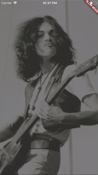
Last week, we ended up with a nice looking artist details page.
While I had played around with animations in Flutter before, there wasn’t a tutorial on how to orchestrate multiple animations together. Since that tutorial now exists, I thought this would be the perfect time to test it out.
Just having a quick glance at the animation APIs, I thought having something meaningful ready would take some time. Learning an entirely new animation API would probably require some getting used to, right?
I was wrong. I was able to whip up the prototype for this tutorial in one hour.
Without further ado, let’s get to animating.
The sample app
Setup
Since we’re going to have seven different source files, it makes sense to organize them well.
This is how the file and folder structure looks like:
See here on how the data directory looks like.
The artist_details_animator.dart and artist_details_enter_animation.dart files don’t exist just yet. That’s fine, we’ll create them later.
Before getting our hands dirty, let’s go over some theory first. We won’t go over the very basics since Sergi and the official documentation both do a great job of explaining that.
What’s a Tween?
Simply put, Tweens can turn a beginning value into an end value gradually and smoothly over time. The most straightforward example would be a Tween between two doubles.
Suppose we have this:
Animation<double> _animation = Tween<double>(
  begin: 0.0,
  end: 1.0,
).animate(_controller);
If the controller has a duration of 1 second and we print the value of the _animation every time it ticks, the output could be something like this:
0.0
0.039983
0.050027
0.066682
0.116699
....
1.0
As we can see, the tween is turning the value 0.0 to 1.0 smoothly with small increments. For example, a night turning into a day would also be a Tween; instead of it happening instantly, it happens gradually.
What’s an Interval curve?
To orchestrate different animations together, we use something called an Interval curve. Interval curves allow us to control the start and end time of an animation.
The minimum value for the start time is 0.0, and maximum value for the end time is 1.0. These values represent points in time in the parent animation that contains the Interval curve.
Let’s take a simple opacity animation for example.
final controller = AnimationController(
  duration: const Duration(seconds: 1),
  vsync: this,
);

Animation<double> opacity = Tween(begin: 0.0, end: 1.0).animate(
  CurvedAnimation(
    parent: controller,
    curve: Interval(
      0.250,
      0.750,
    ),
  ),
);
The duration for this AnimationController is 1 second, which means it takes one second to complete the whole animation. The animation starts at 0.0 and ends at 1.0. In other words, the element in question is animated from invisible to fully visible.
Controlling the start and end time with Intervals
If we run the example above, we can see that the opacity animation only runs for 0.5 seconds. This is because our Interval starts at 0.250 and ends at 0.750.
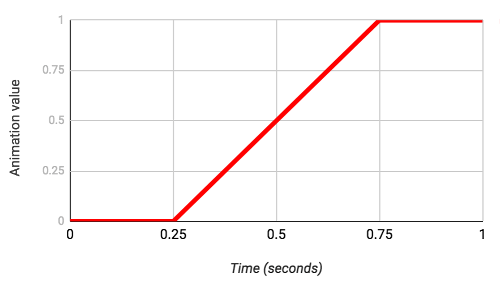
While the opacity is still animated from invisible (0.0) to fully visible (1.0), the animation starts playing at 1/4th and stops 3/4ths in the timeframe of the parent animation.
When should I use Interval curves?
When having only one animation, using the Interval curve doesn’t make much sense. We could just set the duration of the parent animation to 500 milliseconds, get rid of the Interval , and we’d have the same result.
When we have multiple animations which may overlap or start after each other, intervals suddenly become useful. To quote the start of this section, intervals allow us to orchestrate different animations together.
Creating an AnimationController for the main animation
Let’s create a new widget called ArtistDetailsAnimator.
This will be the main animation that all other ones will be based on. It will hold a single AnimationController which will start playing when the widget becomes visible.
In IntelliJ IDEA / Android Studio, there’s a handy live template for a stateful widget with an AnimationController. All we need to do is to write stanim and most of this will be created for us.
import 'artist_details_page.dart';
import 'mock_data.dart';

class ArtistsDetailsAnimator extends StatefulWidget {
  @override
  _ArtistDetailsAnimator createState() => _ArtistDetailsAnimator();
}

class _ArtistDetailsAnimator extends State<ArtistsDetailsAnimator>
    with SingleTickerProviderStateMixin {
  late AnimationController _controller;

  @override
  void initState() {
    super.initState();
    _controller = AnimationController(
      duration: const Duration(milliseconds: 2200),
      vsync: this,
    );
    _controller.forward();
  }

  @override
  void dispose() {
    _controller.dispose();
    super.dispose();
  }

  @override
  Widget build(BuildContext context) {
    return ArtistDetailsPage(
      artist: MockData.andy,
      controller: _controller,
    );
  }
}
We initialize the AnimationController in the initState method, which is called when our widget gets inserted into the widget tree.
By also calling _controller.forward(), the animation starts, plays once, and then finishes. Since we specified 2200 milliseconds as the duration, our entire animation ends after 2200 milliseconds.
We also pass the AnimationController as to the ArtistDetailsPage as a constructor parameter. The reason for this will be clear soon.
Refactoring the ArtistDetailsPage to be animatable
If you followed up to this point, you might have noticed that the IDE is now giving errors. This is because the ArtistDetailsPage doesn’t have a constructor parameter called controller. Another thing is that the parameters are positional, not named ones.
This is how the ArtistDetailsPage currently looks:
class ArtistDetailsPage extends StatelessWidget {
  ArtistDetailsPage(this.artist);
  final Artist artist;

  /* ... */
  @override
  Widget build(BuildContext context) {
    return Scaffold(
      body: Stack(
        fit: StackFit.expand,
        children: [
          /* ... */
        ],
      ),
    );
  }
}
Here are the changes we need to make:
- add a constructor parameter called
controllerto get theAnimationControllerobject from outside this class - make the constructor parameters to be named parameters
- add a member variable called
animationfor a class calledArtistDetailsEnterAnimation. We’ll create the class in the next step. - refactor the
Stackwidget to a method called_buildAnimationand return anAnimatedBuilderfor theScaffoldbody instead.
Seems a lot, but it’s not. Here’s what we end up with:
class ArtistDetailsPage extends StatelessWidget {
  ArtistDetailsPage({
    required this.artist,
    required AnimationController controller,
  }) : animation = ArtistDetailsEnterAnimation(controller);

  final Artist artist;
  final ArtistDetailsEnterAnimation animation;

  /* ... */
  Widget _buildAnimation(BuildContext context, Widget? child) {
    return Stack(
      fit: StackFit.expand,
      children: [
        /* ... */
      ],
    );
  }

  /* ... */
  @override
  Widget build(BuildContext context) {
    return Scaffold(
      body: AnimatedBuilder(
        animation: animation.controller,
        builder: _buildAnimation,
      ),
    );
  }
}
The AnimatedBuilder widget here is responsible for rebuilding its builder parameter whenever the animation changes its value. So, our _buildAnimation method will rebuild the widgets every time the animation ticks.
If we run our app now, we won’t see any animations. Let’s change that.
Creating the file for the animations
While we could have the animations defined in the ArtistDetailsPage widget, I prefer to have a separate class dedicated to them. This allows us to reduce vertical clutter in the UI code.
class ArtistDetailsEnterAnimation {
  ArtistDetailsEnterAnimation(this.controller);
  final AnimationController controller;

  // TODO: We'll create each of the animations soon.
}
Here we merely defined the fields to hold all the animations that we need. Now we’re ready actually to come up with the animations for each element.
Creating the animations
For every one of these animations, we’ll follow the same steps.
- first, we define the
Tweenfor with a begin and end value for the animation. - then, we control the exact spot where the animation starts and ends by using an
Intervalcurve. - after that, we’ll define a custom curve, for example,
Curves.ease. This makes our animations more interesting since they’re not just moving linearly from start to end. - finally, we’ll connect the animation to the UI.
Since the steps are pretty repetitive, we won’t explain each of them in detail. If you’re in a rush, you can see how the animation file looks like here.
The opacity and blur radius of the backdrop image
In the initial prototype for this tutorial, the background opacity and blur animations finished in 300 milliseconds. For some reason, it felt distracting.
It turned out that animating the background slowly was much better. Now the opacity animation takes half, and the blur takes 80% of the parent animation duration to complete, and the effect is much more pleasant.
/* ... */
ArtistDetailsEnterAnimation(this.controller)
    : backdropOpacity = Tween(begin: 0.5, end: 1.0).animate(
        CurvedAnimation(
          parent: controller,
          curve: Interval(
            0.000,
            0.500,
            curve: Curves.ease,
          ),
        ),
      ),
      backdropBlur = Tween(begin: 0.0, end: 5.0).animate(
        CurvedAnimation(
          parent: controller,
          curve: Interval(
            0.000,
            0.800,
            curve: Curves.ease,
          ),
        ),
      )
We animate the transparency of the backdrop image by wrapping it in an Opacity widget. For the blur, we use the BackdropFilter widget that we were already using; we just pass the dynamic value to make it animate.
/* ... */
Widget _buildAnimation(BuildContext context, Widget child) {
  return Stack(
    fit: StackFit.expand,
    children: [
      Opacity(
        opacity: animation.backdropOpacity.value,
        child: Image.asset(artist.backdropPhoto),
      ),
      BackdropFilter(
        filter: ui.ImageFilter.blur(
          sigmaX: animation.backdropBlur.value,
          sigmaY: animation.backdropBlur.value,
        ),
        child: Container(/* ... */),
      ),
    ],
  );
}
The avatar size animation
The avatar animation uses a fun curve called elasticOut. This brings a nice bouncy effect that plays until just under halfway into the main animation.
ArtistDetailsEnterAnimation(this.controller)
    : // ...
      avatarSize = Tween(begin: 0.0, end: 1.0).animate(
        CurvedAnimation(
          parent: controller,
          curve: Interval(
            0.100,
            0.400,
            curve: Curves.elasticOut,
          ),
        ),
      )
For this size effect, we wrap the existing avatar widget into a Transform widget. Since we use the Matrix4.diagonal3Values transformation, we can control the size of the avatar before it’s painted.
By setting the alignment property to Alignment.center, the avatar starts to expand straight from the middle, and not, for example, the top left corner.
/* ... */
Widget _buildAvatar() {
  return Transform(
    alignment: Alignment.center,
    transform: Matrix4.diagonal3Values(
      animation.avatarSize.value,
      animation.avatarSize.value,
      1.0,
    ),
    child: Container(/* .. */),
  );
}
The name, location, divider and biography animations

Here comes the next logical section. This might seem like a lot of code at once, but it’s nothing to get afraid of.
You might notice that the name opacity animates from 0.0 to 1.0, while the rest of the texts animate to 0.85. This is simply because the location and biography texts are supposed to be a little bit lighter than the artist name.
The divider width uses a fastOutSlowIn curve, which makes it look like someone is just quickly drawing the line with a pen.
ArtistDetailsEnterAnimation(this.controller)
    : // ...
      nameOpacity = Tween(begin: 0.0, end: 1.0).animate(
        CurvedAnimation(
          parent: controller,
          curve: Interval(
            0.350,
            0.450,
            curve: Curves.easeIn,
          ),
        ),
      ),
      locationOpacity = Tween(begin: 0.0, end: 0.85).animate(
        CurvedAnimation(
          parent: controller,
          curve: Interval(
            0.500,
            0.600,
            curve: Curves.easeIn,
          ),
        ),
      ),
      dividerWidth = Tween(begin: 0.0, end: 225.0).animate(
        CurvedAnimation(
          parent: controller,
          curve: Interval(
            0.650,
            0.750,
            curve: Curves.fastOutSlowIn,
          ),
        ),
      ),
      biographyOpacity = Tween(begin: 0.0, end: 0.85).animate(
        CurvedAnimation(
          parent: controller,
          curve: Interval(
            0.750,
            0.900,
            curve: Curves.easeIn,
          ),
        ),
      )
The divider is merely a Container widget that has a height of 1.0 and animated width.
The UI code for the text animations uses a little trick. By using the withOpacity method of the Color class, we can avoid wrapping every single Text widget in an Opacity widget.
/* ... */
Widget _buildInfo() {
  // ...
  return Column(
    children: [
      Text(
        artist.firstName + '\n' + artist.lastName,
        style: TextStyle(
          // ...
          color: Colors.white.withOpacity(animation.nameOpacity.value),
        ),
      ),
      Text(
        artist.location,
        style: TextStyle(
          // ...
          color: Colors.white.withOpacity(animation.locationOpacity.value),
        ),
      ),
      Container(
        color: Colors.white.withOpacity(0.85),
        margin: const EdgeInsets.symmetric(vertical: 16.0),
        width: animation.dividerWidth.value,
        height: 1.0,
      ),
      Text(
        artist.biography,
        style: TextStyle(
          // ...
          color: Colors.white.withOpacity(animation.biographyOpacity.value),
        ),
      ),
    ],
  );
}
The position and opacity for the video scroller

If you got this far, these animations here should be familiar to you. Just some regular old Tweens and Intervals.
ArtistDetailsEnterAnimation(this.controller)
    :
      // ...
      videoScrollerXTranslation = Tween(begin: 60.0, end: 0.0).animate(
        CurvedAnimation(
          parent: controller,
          curve: Interval(
            0.830,
            1.000,
            curve: Curves.ease,
          ),
        ),
      ),
      videoScrollerOpacity = Tween(begin: 0.0, end: 1.0).animate(
        CurvedAnimation(
          parent: controller,
          curve: Interval(
            0.830,
            1.000,
            curve: Curves.fastOutSlowIn,
          ),
        ),
      )
We meet the Transform widget again. This time, we use the Matrix4.translationValues transformation, which moves the widgets pixels before painting it on screen. The three values stand for x, y, and z, but since we want to animate the horizontal position, we only use the x value.
/* ... */
Widget _buildVideoScroller() {
  return Padding(
    padding: const EdgeInsets.only(top: 16.0),
    child: Transform(
      transform: Matrix4.translationValues(
        animation.videoScrollerXTranslation.value,
        0.0,
        0.0,
      ),
      child: Opacity(
        opacity: animation.videoScrollerOpacity.value,
        child: SizedBox.fromSize(/* ... */),
      ),
    ),
  );
}
And that’s it!
If you got lost, here’s the entire file that has the animations defined.
Conclusion
If you missed it, the sample app is here.
While Flutter’s animation APIs might be different than in native Android or iOS, they’ll start making sense quite fast. Tweens are powerful: along with lots of other things, we can lerp between Colors, TextStyles and even Themes.
Stay tuned for more animation awesomeness!
4 comments
likes